Amazon HR
Inside Amazon
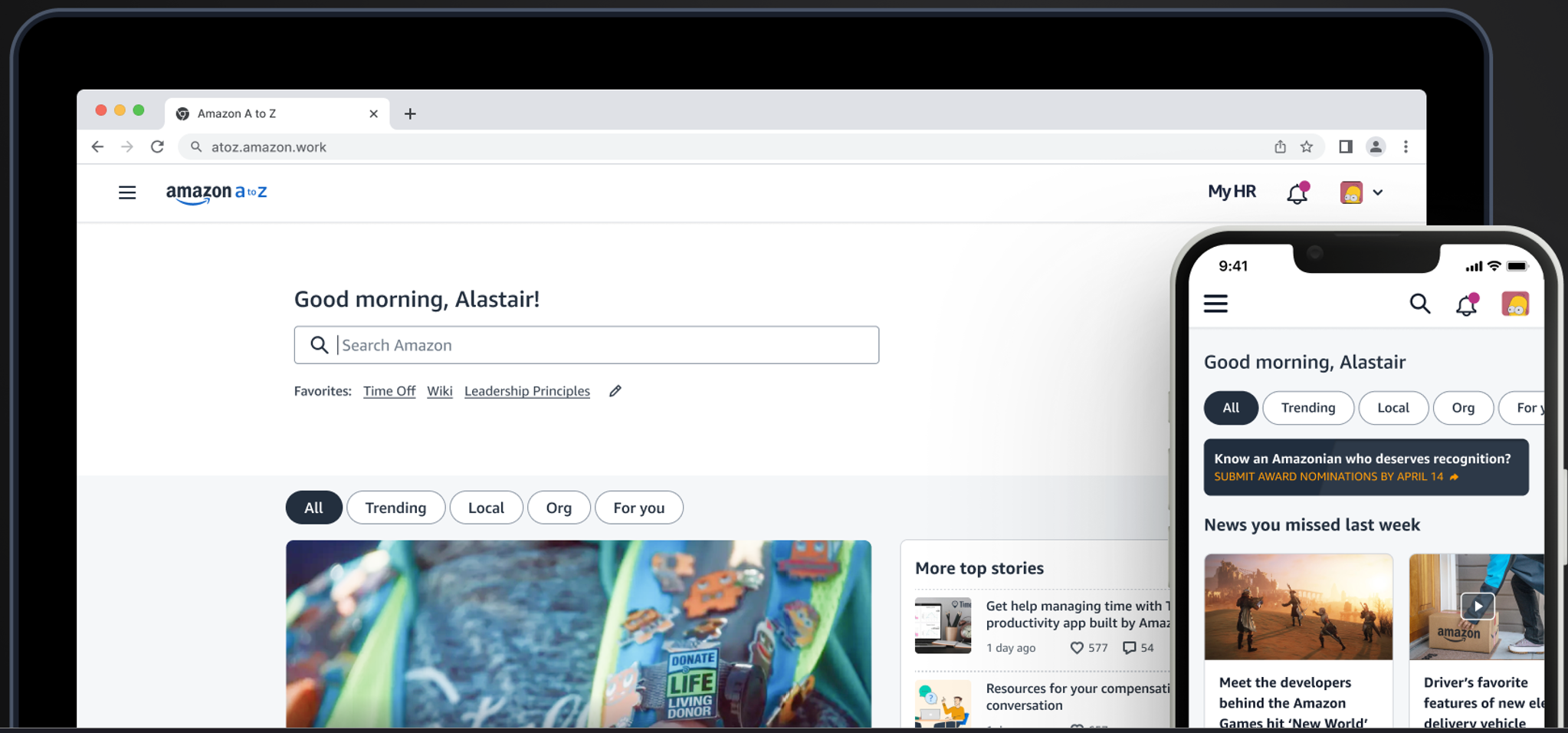
Inside Amazon is the default corporate landing page for all Amazon Employees. It’s used to search documents across the company, for corporate communications, it’s where employees go to find the latest corporate policies relating to HR and business practice, it’s the launch page for phone tool, news, HR tools and
organizational documents. 100’s of thousands of views a day
Situation
The webpage has not been wholly owned by a single team. Corp communications owned the news feed, HR owned the hr tooling, the share point based search wasn’t owned by a team, and neither was phonetool. The search only searched items housed in the share point system, not the massive Amazon wiki. Different teams had added items such as a “download mobile app” QR code. Inside had also become the only way via 4 clicks to reliably access travel and expense experiences. The visual design was jumbled and dated and not aligned visually to any system beyond using the Amazon orange as a highlight color. The site was not mobile optimized or visually accessible.
Task
My team began by writing a doc called oneAmazon that described a single modern page that was designed to encompass all the areas Inside needed to address. We started with the vision of a single search, a single feed and a user friendly navigation that was relevant to that users context (manager or individual contributor.
Activity
I worked across three design teams their leaders and General Managers to gather their ideas and directions. Initially as 1:1’s to build trust and credibility but
quickly we scaled up to a 20 person virtual workshop that brought key members
together to hear ideas as well as pushback on different directions. We recorded the share out sessions and summarized them for others to quickly catch up if they joined late and wanted to contribute. We also had a virtual board where the whole org could provide input. In a group setting we defined a joint agreed direction as well as areas that needed to be fleshed out.
Result
The result was a new page that was web and mobile optimized being based on the Stencil Design system. A single search solution that searched all doc including wiki. More relevant content taking into account the users locale and presenting news relevant to them not only the Seattle news. A single feed of relevant
notifications and news. A consistent navigation and toolbar across all pages to provide confidence that these were Amazon corp pages. Simplified wording for navigation with groupings based around the employee journey not product team organization.
Inside Amazon
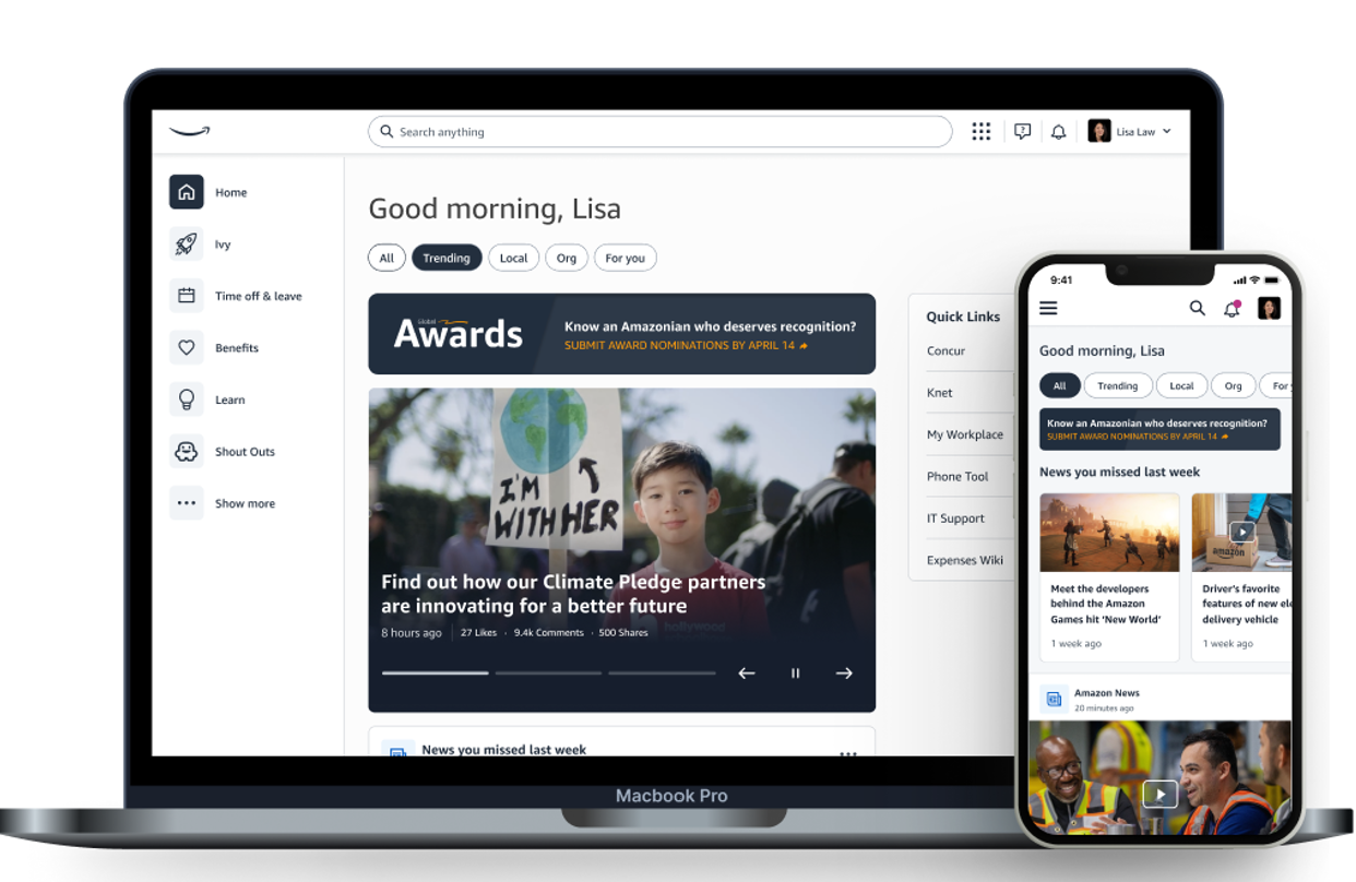
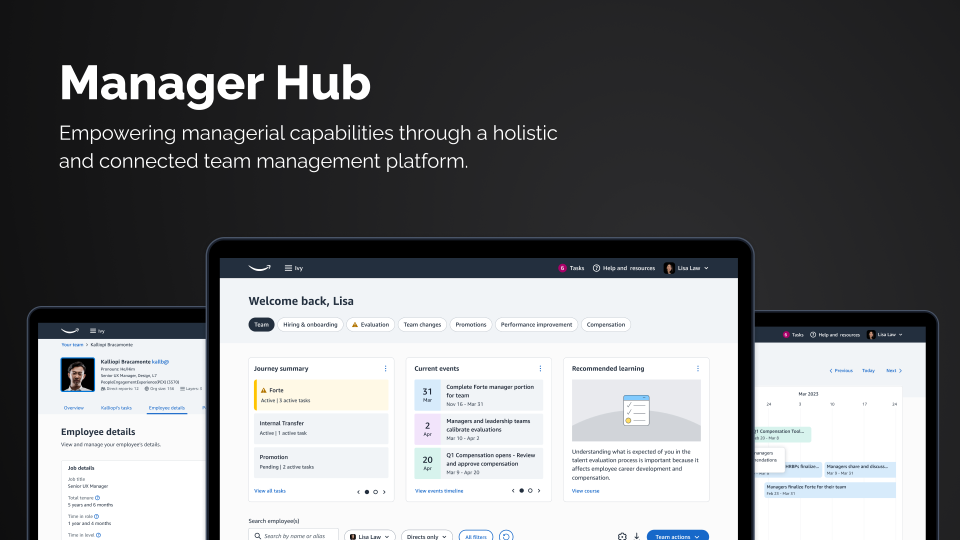
Amazon IVY and Manager Hub
Situation
Ivy was the name of the new HR portal which had rapidly become the single source of information for all HR tooling for all 100,000 or so corporate employees. New HR products were coming online quickly and some organizations had housed their products in other places in the Amazon corporate internet structure such as Sharepoint or Inside Amazon. At the time Amazon was hiring fast with thousands of new employees and managers a month , that had to quickly get to grasps with career coaching, annual reviews, compensation discussions, hiring and interviewing and everything that a large corporation need to support it employees. The feedback was that new managers didn’t know what the different product names were and hence didn’t know to go to “Forte” for annual review or “Lift” for team calibration or “Inginii” for career coaching or Pivot for underperforming employees. Compensation was found
elsewhere. And new manager tools didn’t have a clear place to exists within the IC focused of IVY.
Task
We were tasked to create a simple to understand single place to go to manage tasks relevant to them (as an individual or as a manager). A secure place that was available both on web and mobile. That felt integrated into the Amazon Intranet.
Activity
Our research team interviewed hundreds of employees, long and short tenure, senior and junior to understand what they wanted from Ivy. Our design team connected with the different teams to understand their long term goals and to start to discuss how they would integrate into the new menu structure.
The team carried out tree testing to assess users efficiency of finding core information versus the old site with significant improvements.
Result
A new scalable menu organized around the employee journey of hiring, managing reviewing and coaching. Abstract product names were prefaced with more user friendly descriptive term such as “Annual Review (Forte)” or “Career Goals (inginii)”.
This satisfied the long term amazonians as well as the new starts. The menu
was user role dependent so managers had their own career but also a whole section for their team.
The new menu and page were rolled out in 2022.
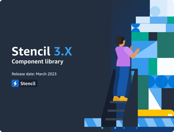
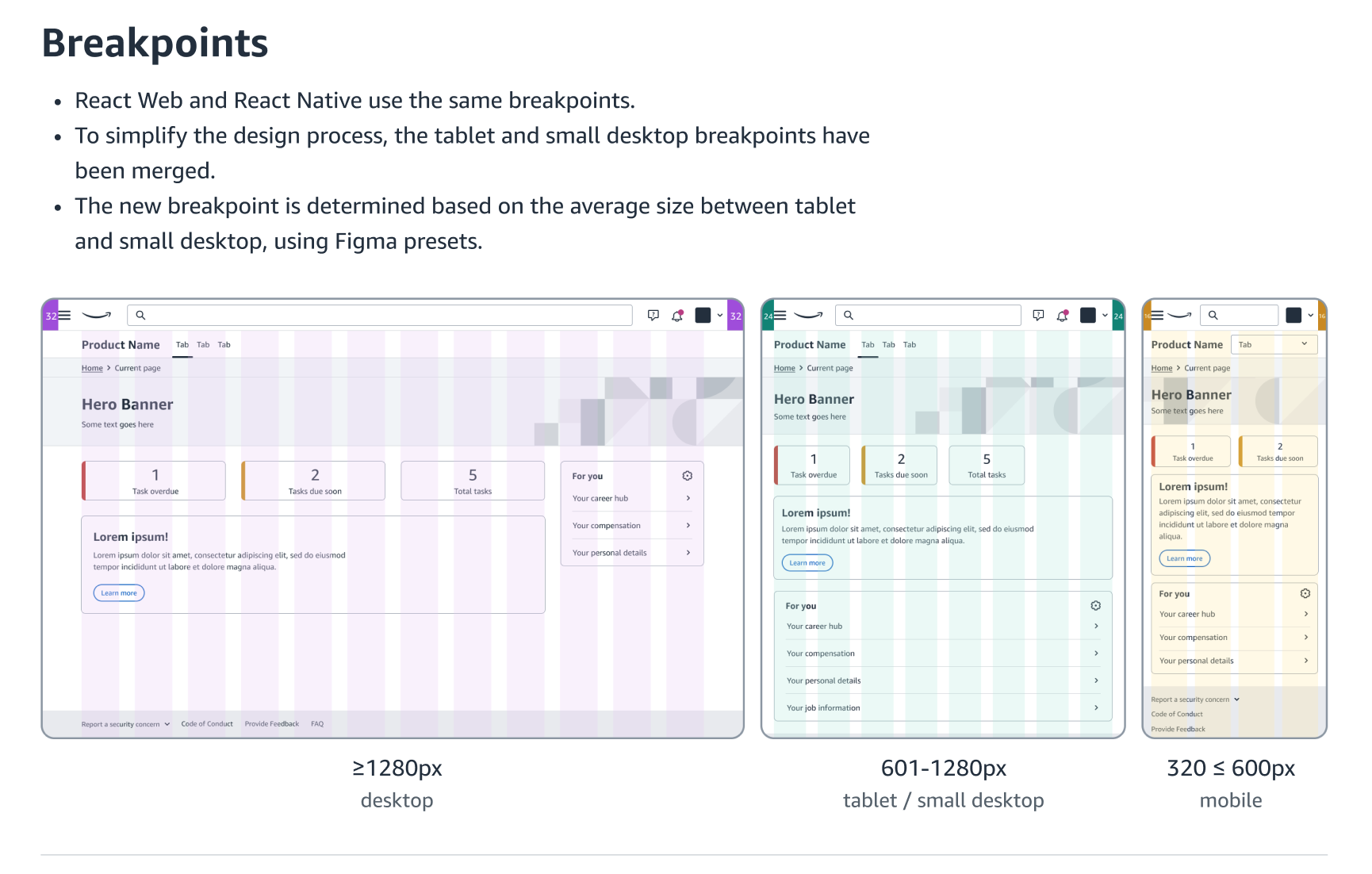
Stencil Design System
Led a comprehensive design system to ensure consistency across web and mobile platforms for both corporate and associate Amazonians.
Situation
Amazon employees were not receiving a consistent and high quality UX experience during their hiring, everyday work and beyond. While “Hire” the recruiting and interview tool at Amazon had a strong style guide it looked very different from Inside Amazon (the corporate homepage) and also the associate experience A to Z mobile
app.
Task
Align teams across the HR organization towards a single high quality web and mobile design system.
Activity
Our design system designers worked with core branding to define an official sub-brand of Amazon. The team then defined and built the core components and showcased them as parts of the Inside Amazon rebuild. We Road-showed the design system across teams inside HR and out.
Result
As many teams were small and building one off solutions, alignment to a single design system was very attractive. It reduced work for them and provided proven value in being web and mobile optimized.
Stencil was rapidly over subscribed in terms of new component requests that we had to set up a third party component build process that involved UX reviews and sign off to ensure we could scale at the required pace.
Stencil Example
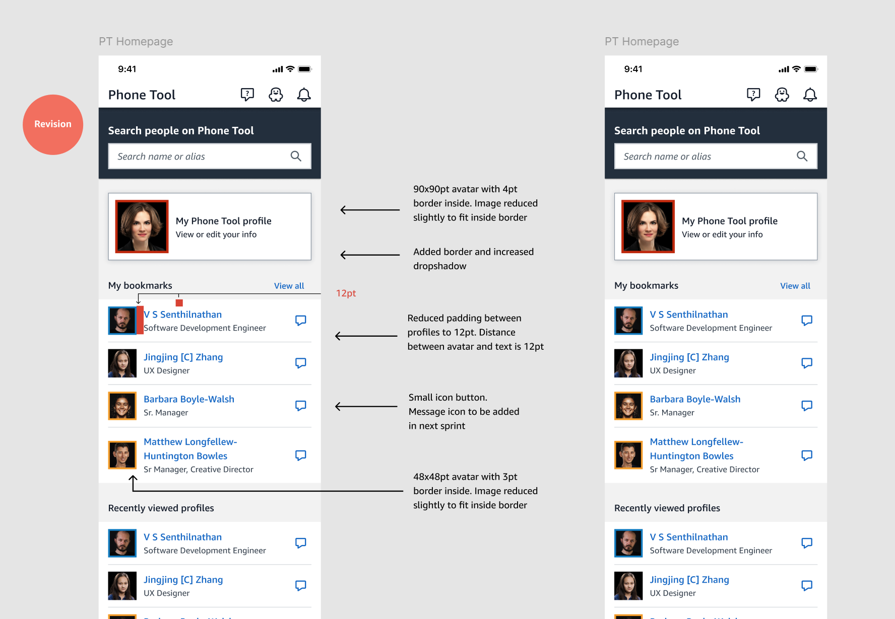
Amazon PhoneTool
Situation
A most beloved webpage used inside Amazon to find people, navigate teams and organization and collect icons. No team had touched the code in over 10 years beyond adding a link to respond to survey. Hence the site looked dated and didn’t lend itself to enabling modern experiences such as integrating slack or chime. People really wanted to access it on their phones to check office locations or availability while on the move without having to open laptop. In general they wanted a more relevant and modern phonetool.
Task
Multiple teams had provided concepts for what phonetool could become. We embraced those directions and worked to use it showcase stencil mobile but also how to integrate it into the inside Amazon experience for corp and the associate experience in A to Z.
Activity
Work between corp and associate teams and directors to illustrate the simplicity and value of an updated phonetool. Also prioritized stencil components relevant to people and “cards” to ensure consistent presentation of people across products.
Result
While phonetool as a page was released the real result was the focus on ensuring
phonetool was no longer an island to itself. People are the core element of all
hr products and phonetool experiences we’re now integrated into inside Amazon,
Ivy the hr toolset and A to Z the associate experience. A mobile experience was
also launched.
PhoneTool (Mobile)